“Can you guys Photoshop Paint Colors?”
That’s how the call usually comes in.
When it comes to selecting the perfect paint colors for a commercial property, the process can often be overwhelming. This is especially true for large buildings like hotels, where the impact of a chosen color palette can significantly influence the overall ambiance and customer perception. The Comfort Inn faced this challenge head-on as they embarked on a journey to revamp the exterior of their hotel. They needed a solution that would allow them to visualize different paint color options effectively before making a final decision. This is where the expertise of J. Scott Smith Visual Designs, Inc., in architectural rendering with Photoshop came into play, offering a precise and cost-effective method to explore various aesthetic possibilities using Photoshop paint colors.
Our Solution: Architectural Rendering with Photoshop
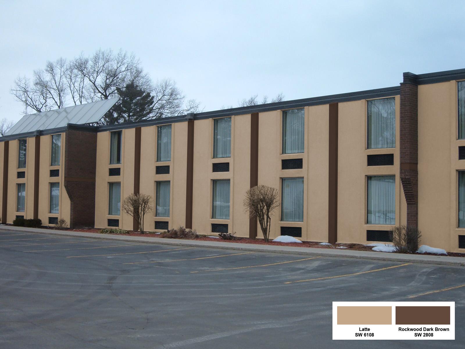
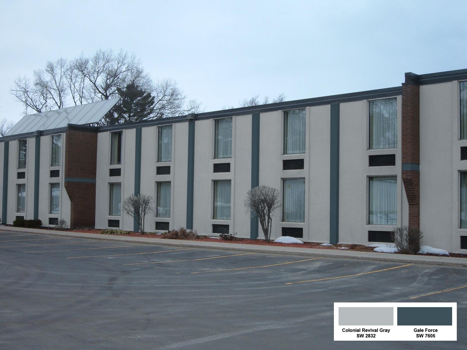
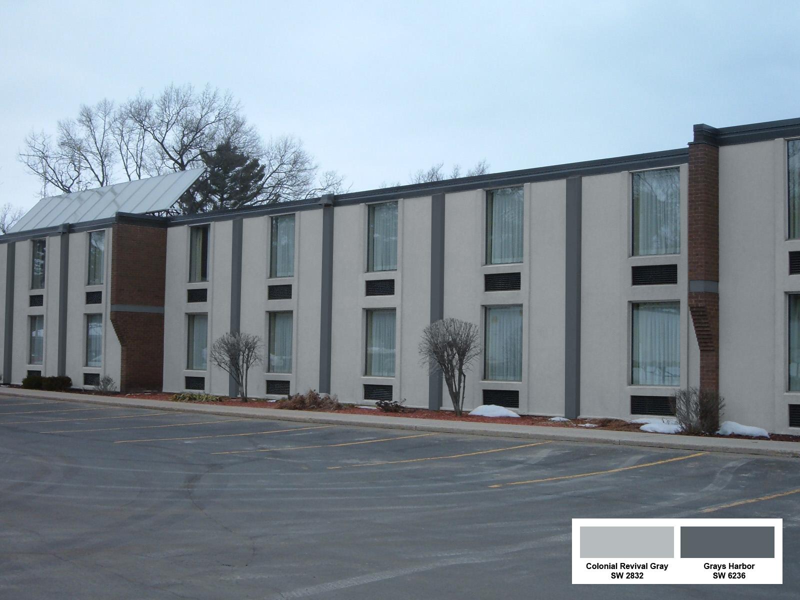
The Comfort Inn team provided us with a selection of specific color choices from the renowned paint manufacturer, Sherwin-Williams. Understanding the importance of accuracy and detail, we employed Adobe Photoshop, a powerful tool for creating artist renderings, to digitally apply these paint colors to a photograph of the hotel building. Our goal was to produce highly realistic elevation renderings that would enable the Comfort Inn management to see exactly how each color would look in reality.
Effectively Using Architectural Renderings with Photshop
Our Photoshop expert utilized a combination of advanced techniques to ensure the architectural renderings with Photoshop were as accurate as possible. These techniques included the use of masks, selections, and blend modes. Masks allowed us to isolate specific areas of the building that needed to be painted, ensuring clean and precise application of Photoshop paint colors. Selections helped in defining boundaries and making sure the paint didn’t bleed into unwanted areas. Blend modes were essential in achieving a natural look, as they helped to mimic the way paint interacts with different textures and lighting conditions on the building’s surface.
Advantages of artistic and elevation Renderings
One of the significant advantages of using Photoshop paint colors for visualization is the ability to work with digital swatches. For this project, we included the Sherwin-Williams color swatches, complete with the manufacturer’s product numbers, directly on the images. This feature was crucial in preventing any confusion and ensuring that the exact colors being considered were clearly communicated. It also provided an easy reference point for the decision-makers at Comfort Inn when discussing options with their team.
The process of creating architectural renderings in Photoshop offers numerous benefits over traditional methods. First, it is much quicker and less expensive than physically painting and repainting parts of the building. By digitally Photoshopping paint colors, we avoided the costs associated with hiring a crew to test different colors on the actual structure. This approach also eliminated the frustration that can come with discovering that a chosen color doesn’t look as expected after it has been applied.
Furthermore, our artist renderings provided a comprehensive view of how the entire building would appear with each paint color. This holistic perspective is something that small sample patches on a wall simply cannot offer. Seeing the complete picture helped the Comfort Inn team make an informed decision, confident that the chosen color scheme would enhance the building’s appearance and appeal to guests.
Impact on Decision-Making
Our work with Comfort Inn is a prime example of how architectural rendering with Photoshop can transform the decision-making process in commercial design projects. The ability to visualize different paint colors digitally not only streamlines the selection process but also ensures a higher degree of satisfaction with the final outcome. This method of rendering is particularly beneficial for large-scale projects where the visual impact of color choices can significantly affect the brand image and customer experience.
Artistic and Practical Benefits
In addition to providing practical solutions for paint color visualization, our Photoshop renderings also offer an artistic touch. The detailed and lifelike elevation renderings we produce are a blend of technical precision and creative flair. This combination ensures that the final images are not only accurate representations but also visually engaging, making the decision process more enjoyable for clients.
For those in the architectural and design industries, the use of Photoshop for elevation renderings is a game-changer. It allows for experimentation with different design elements without the need for physical alterations, saving both time and resources. The ability to see potential changes in a realistic digital format can inspire new ideas and lead to better design outcomes.
Conclusion
Our collaboration with Comfort Inn showcases the effectiveness of using Adobe Photoshop for architectural renderings, particularly when selecting paint colors. By providing detailed, accurate, and aesthetically pleasing visualizations, we helped the Comfort Inn team make an informed decision with confidence. This approach not only simplified the selection process but also ensured that the final choice would enhance the hotel’s exterior appeal, ultimately contributing to a more inviting atmosphere for their guests.
Whether you are a hotel chain, a commercial property developer, or an architect, incorporating architectural renderings with Photoshop into your design process can significantly enhance your ability to make well-informed decisions. The precision and versatility offered by Photoshop make it an invaluable tool in the realm of architectural rendering, allowing you to explore a multitude of design possibilities with ease and confidence.


0 Comments