Color temperatures play an important role in our lives, but there’s a good chance you’re not even familiar with the term. It’s possible you’ve noticed a reference to the term on a light bulb’s packaging, but its meaning isn’t immediately evident. It’s useful to have a basic understanding of what color temperature is and why we should care. In this blog post, we will define color temperature and explain how it affects everything from the way we feel to the design of our homes. We’ll also take a look at some examples of color temperature in action and discuss how you can use them to improve your own life and work.
What is color temperature?
Color temperature is a measure of the color of light. Often, artists and even laypeople speak about colors being “warm” or “cool”, but did you know it’s not just a vibe? It’s something that can be measured and replicated.
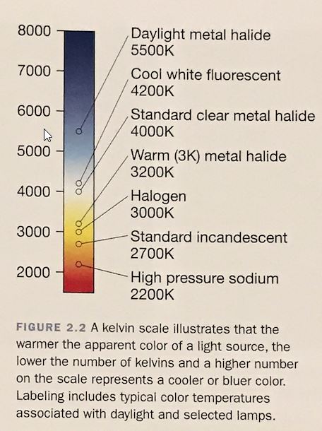
Color temperature is measured in degrees – but not Fahrenheit or even celsius, but in Kelvin (K). Not to get too nerdy, but the concept comes from taking a theoretical “black body” and heating it until it glows. The color of the light emitted by this object will change as it gets hotter, and we can map that color to a numerical value. The numerical value corresponds to the heat of the object.
Warm colors have lower color temperatures, while cool colors have higher color temperatures. For example, fire is usually around 1800K, while blue sky is around 10000K. Manmade light sources, like lightbulbs and screens, also have color temperatures. The color temperatures that may be achieved often depend upon the type of light – for instance, halogen, fluorescent, and sodium lights each put out light in a particular range.
How color temperature affects our moods
While color temperature is measured objectively, it also has a subjective component. We perceive colors differently based on the influence of the room’s lighting. It can even affect our moods and heart rates! For example, blue light is associated with feelings of alertness, while yellow light is associated with relaxation. This is why the color of light is something designers (and even homeowners!) should keep in mind.
Examples of color temperatures in action
The easiest way to see color temperature and note its effects is to experience it. Below is a brief video we created to illustrate the concept. In this video, we rendered the same scene with light sources set to several different temperatures for you to evaluate.
Color temperature in renderings
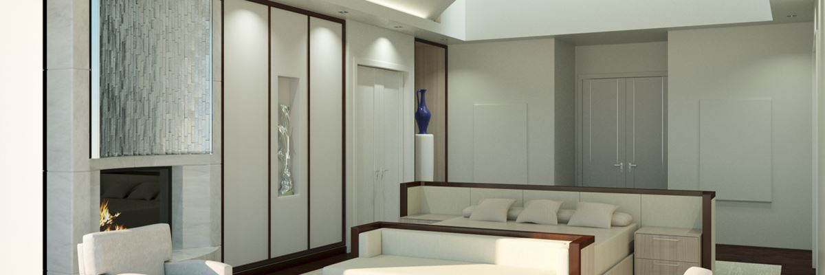
This is an underutilized skill in most renderings, but an important one to get right. Your design will look drastically different under different lighting conditions. The most skilled designers take this into account and use it to their advantage. And the skilled 3D rendering studio employs artists who are careful to represent the design accurately so this is portrayed.
How to use them to improve your life and work
If you’re like most people, you probably don’t give much thought to the color of the light around you. But did you know that it can have a big impact on your mood and productivity? Here’s a quick guide to color temperatures and how you can use them to improve your life and work.
Most people are familiar with cool blue light, which is often used to stimulate wakefulness and alertness. This is why blue light is often used in office environments. However, too much blue light can also lead to eye strain and fatigue. That’s why it’s important to find a balance between cool and warm light depending on the task at hand.
Warm light, on the other hand, is calming and relaxing. It’s perfect for creating a cozy atmosphere in your home. And studies have shown that warm light can help improve sleep quality. If you’re looking to wind down at the end of the day or get a good night’s sleep, try using warmer yellow or orange lighting.
By understanding color temperature, you can create an environment that’s tailored to your needs and helps you be your best self. So next time you’re shopping for light bulbs, keep an eye out for the light’s rating.
Take home message
Color temperature is a real thing! It’s not just some vague feeling. It’s measurable, it can be replicated, and it has an effect on our moods. The next time you’re considering the color of light in your home or office, try keeping it in mind! And, if you’re an architect or interior designer making specifications for client’s spaces, rest assured that we will accurately represent your design and all the thought you put into it – right down to the accurate colors of the lights.


0 Comments
Trackbacks/Pingbacks