Scott Smith Visual Designs, Inc., takes pride in helping the community expand and grow and especially enjoys working with architects who are designing new buildings in our hometown of Traverse City, MI. We recently had the pleasure of working with architect Richard Skendzel and interior designer Houtteman Interiors on the new State Savings Bank at 862 S. Garfield Ave.
Originally started in Frankfort, State Savings Bank is a community pillar that opened more than 125 years ago. It is trusted by many and we were honored to have the chance to help them visualize their new 17,575-square-foot facility.
first steps
When the previous building was demolished in 2022, State Savings Bank needed a new design. Once they found the right one, they needed a team to help take the design and make it into renderings they could share with their investors, customers, and the community.
State Savings Bank Chief Marketing Officer Doug Zernow spoke of the project stating, “Frankfort is where the bank started. It’s technically still the headquarters, but when this building will be completed, this will be our principal office.” With such a tall order, J. Scott Smith Visual Designs wanted to make sure that we visualized the building accurately and with detail on both the outside and the inside.
clay rendering
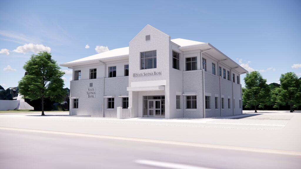
We took the plans and the design and created a basic concept rendering, what we call a clay rendering. Using some of the finest technology on the market, this rendering allows a client to visualize and communicate their design without adding the distractions of paint, texture-specific brick, shingle selection, or other limiting details.
After reviewing the physical design and making some modifications, the client wanted more. Sometimes clay renderings are enough, but when used for marketing purposes, more is usually required to adequately convey the complete look and detail of a project.
So we added architectural details, textures, highlights, shadows, and even some landscaping. This process involved color palettes and texture samples from the client and a lot of skilled labor from our office.
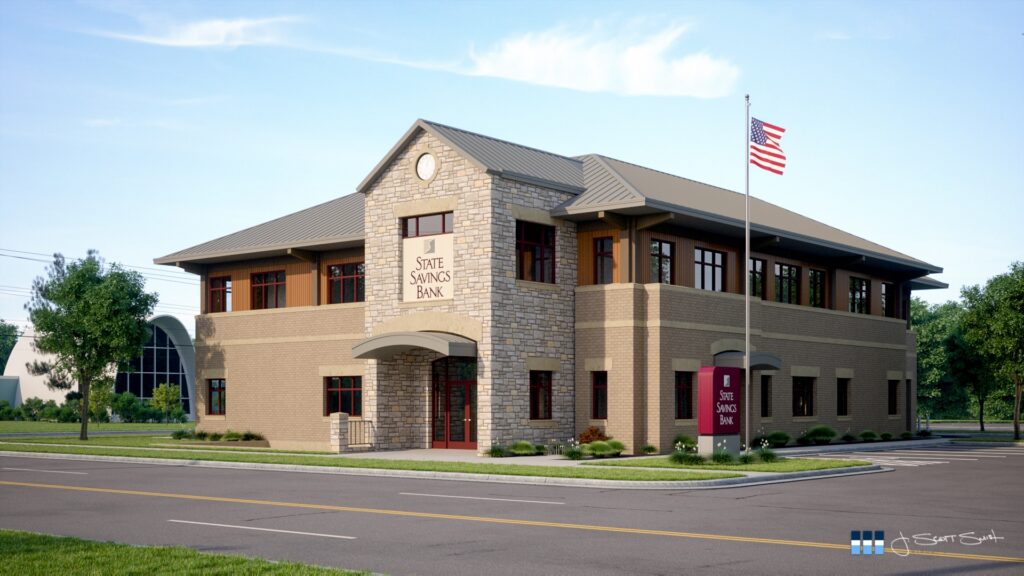
Here you see the design in greater detail.
We knew that proper visualization would be crucial for the client to be able to effectively communicate their design. We took our time, carefully making sure that each piece was properly placed and detailed.
Interior Rendering Process
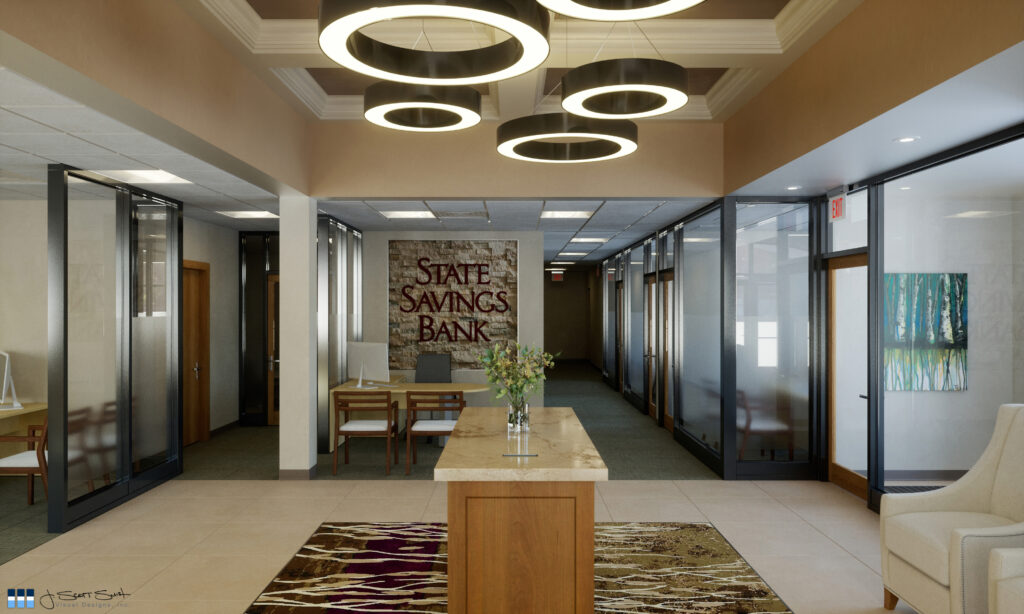
The interior rendering process was just as detailed and involved as the exterior, if not more so. The interior of a building is where people will feel comfortable or uncomfortable, and communicating the design effectively is important. The better you can help others visualize the look and feel of the interior space, the better it will turn out.
We once again took their plans and their ideas, and we created a visualization that matched their design. We included the fine details, such as the carpeting, the flowers in the vase, the signage, and the comfortable chairs. Our job is to make the space look real before it’s real. Essentially, we’re here to help you visualize the future.
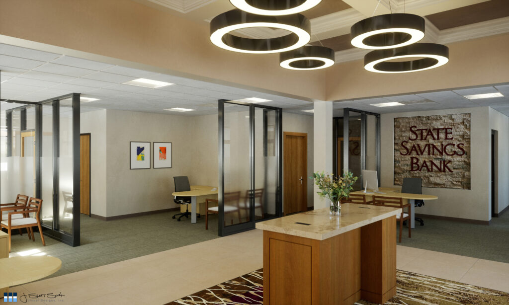
Part of communicating a space is viewing it from more than one angle, as we’ve done here. It’s important that you’re able to visualize all areas as this allows the client to get a better understanding of the spatial quality of their design and will help them choose and change any fine details.
This view was created to help the bank see another side of the interior, allowing them to decide if their design was right for them. As with the exterior, we did a series of renderings for them to evaluate a couple of color palettes, different stone, and metal materials. Renderings even helped them determine the size of the placement of the lights by seeing multiple versions.
After Construction
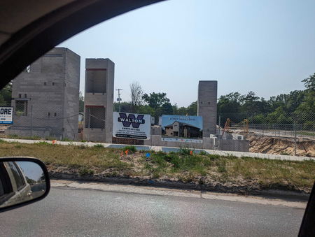
It’s going great!
We love seeing a project that we’ve contributed to finally being realized. And it’s always fulfilling seeing our work on a job site sign.
While we are not the designers of the space and we do not pick out the specific materials, we do our best to faithfully depict the architect and the designer’s designs so that our clients can evaluate their options up front and then proceed with confidence that they are spending their funds and time as efficiently as possible.
We were thrilled when State Savings Bank used our images for promoting their project and for seeking necessary approvals and were glad to be part of the continuing legacy of this community business.
Here you can watch a video rendering of the project!
Here at J Scott Smith Visual Designs, we take pride in every single project that we’re trusted with. Our team of skilled 3D artists is ready around the clock to help you visualize your designs, one small detail at a time.
We utilize the latest technology, keeping our practices up to date to offer you the finest visualization services on the market. From banks to homes and everything in between, we’re here to help you see it better with a 3D render.
Are you ready to see things clearly?
Contact us today to hear more about our many visualization services, including renderings of commercial spaces like State Savings Bank.
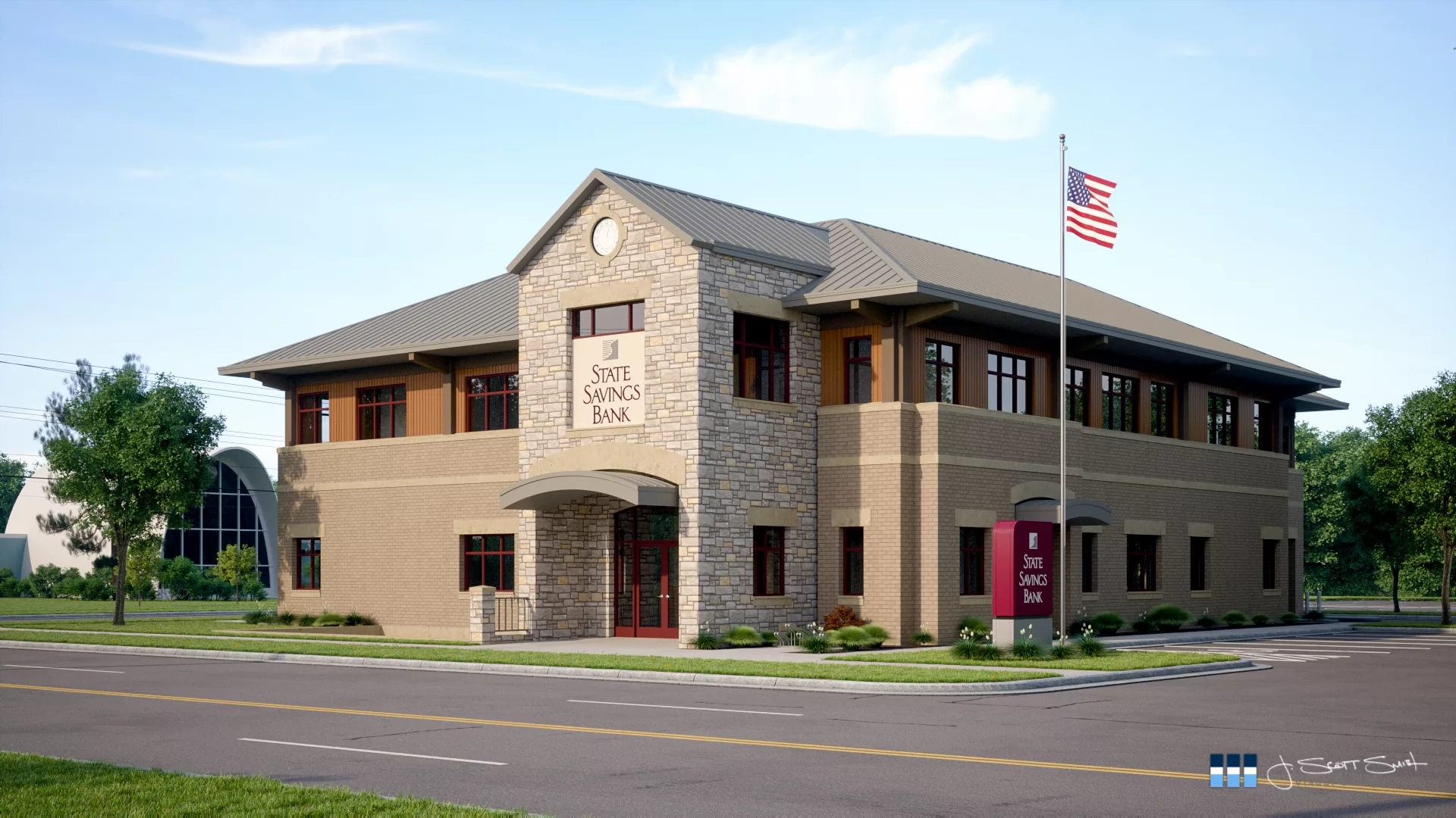
Well done architecture- 3 dimensional, base/ middle/ Prairie style cap overhang and details…. well done!
In the past 20 years, Traverse City has never been known for good architecture… thanks!
I agree. Rick Skendzel of Architecture Technology does fantastic work!
https://www.architecturetech.com/